Photura.
Identity
in motion.

How Photura’s flat identity became a generative Metal system that could move, cast light, and respond to the product experience.

Artifact light scene

A symbol

The identity began as two simple forms: a mountain and a circle.
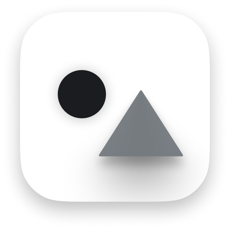
Photura app icon with a dark circle and dimensional gray mountain form
App icon — lightAugust 2025

Giving it matter

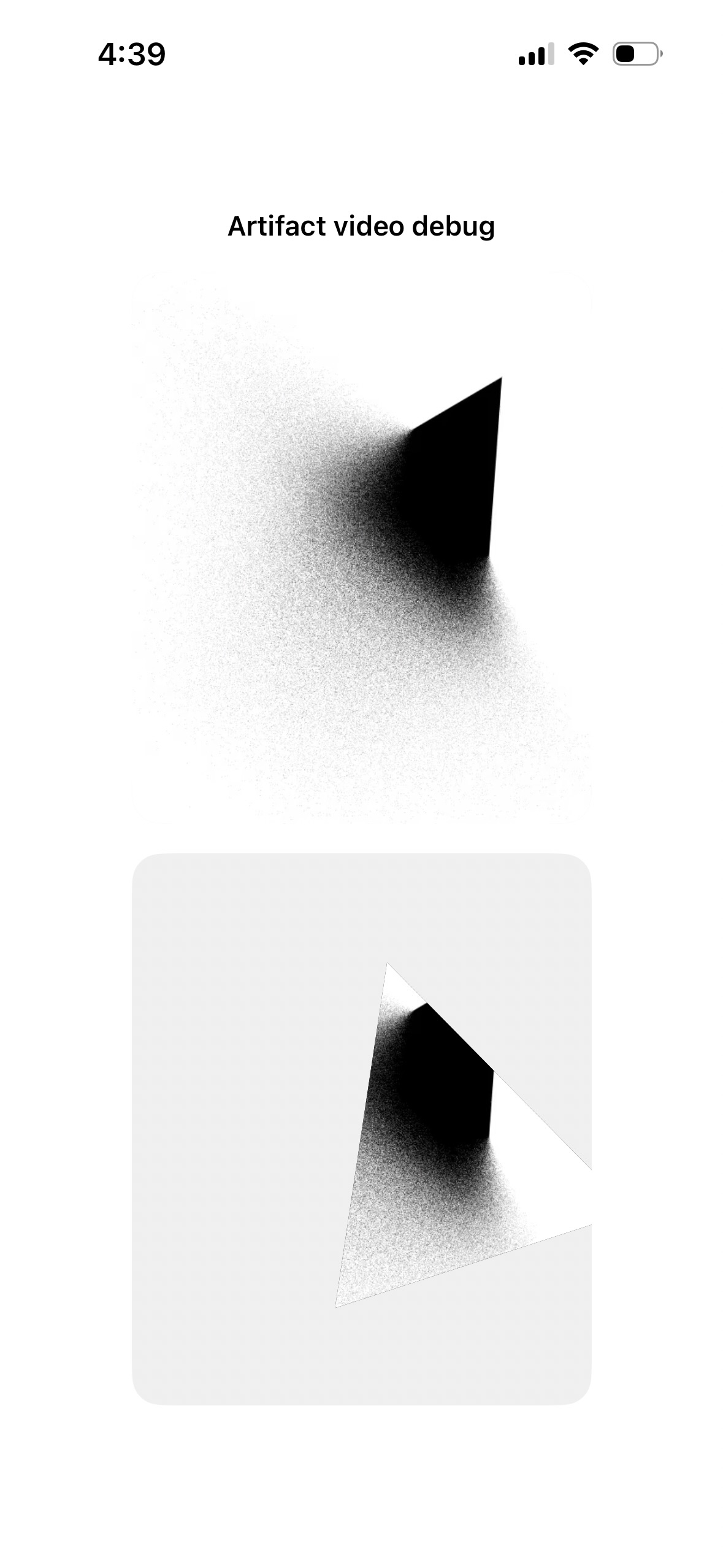
The first Metal studies introduced grain, shadow, depth, and chromatic separation.
0:00 / 0:00
Photura artifact debug view comparing raw and transformed render outputs
Artifact video debugComposite / transform

Making it behave

Motion turned a logo into an object—with weight, drift, and a point of view.

0:00 / 0:00
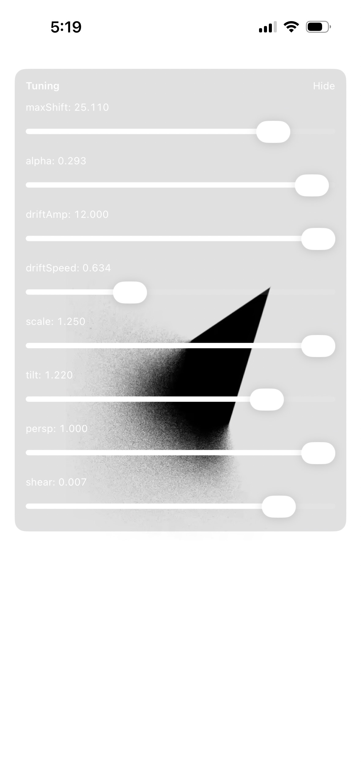
maxShift
25.110
alpha
0.293
driftAmp
12.000
driftSpeed
0.634
scale
1.250
tilt
1.220
persp
1.000
shear
0.007

Building the instrument

The work became tunable: shift, alpha, drift, scale, tilt, perspective, shear.

Why this mattered

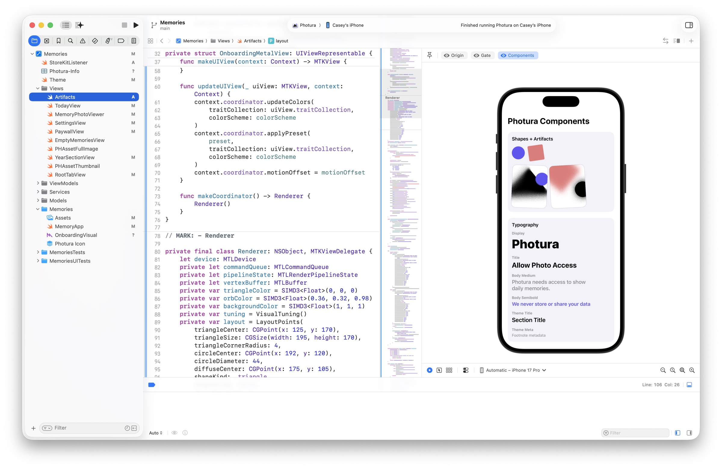
Turning the shader parameters into live controls made iteration immediate and precise. Rather than hand-editing constants—or prompting Codex or Claude for every adjustment—I could tune the relationships in real time, compare outcomes, and commit only what worked.

Live Photura Metal tuning interface with sliders for shift, alpha, drift, scale, tilt, perspective, and shear
Live tuning surfaceMetal / SwiftUI
Xcode showing the Photura Metal renderer alongside a live SwiftUI component preview
Renderer in contextXcode / SwiftUI + Metal

Giving it a product role

The system learned to respond to context—quiet at welcome, warm at permission, luminous in the dark.

Responsive light March 2026
Responsive dark March 2026
Final artifact

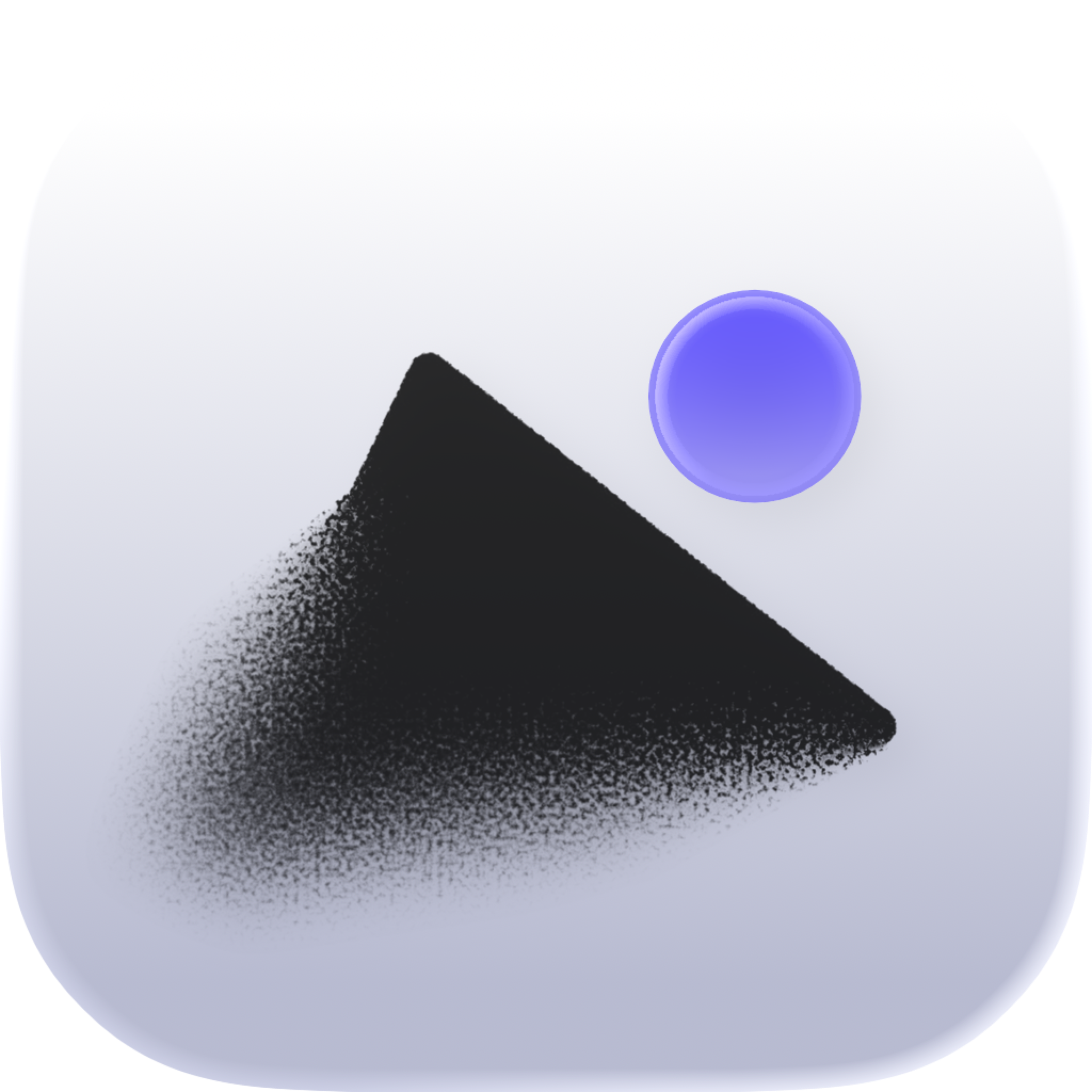
The effects became the icon.

Grain, diffusion, light, and the tension between the two forms carried out of the onboarding experience and into the app icon. The behavior of the system was compressed back into a single image.

Final Photura app icon with a grainy dark mountain and luminous violet circle
Final app iconiOS