
 03 / LEARNING BY BUILDING
Native can still be distinctive.
SwiftUI made the distinction between behavior and presentation clearer. I could preserve familiar interactions while giving the app its own typography, surfaces, transitions, and visual tone.
A quieter way to
come back to your photos.
I designed, built, and shipped an ad-free iPhone memories app—learning SwiftUI and Xcode along the way.
View on the App Store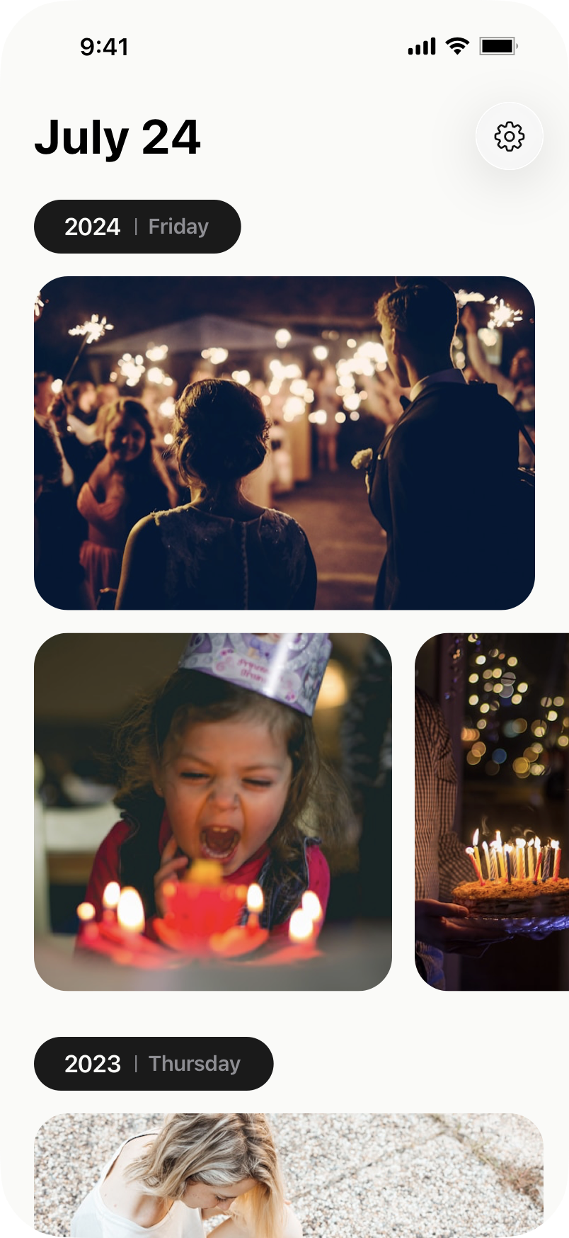
01 / THE IDEA
I started Photura because I wanted a better way to revisit old photos. The memories apps I had used felt dated and cluttered. Seeing ads inserted between personal photos of my kids made the problem feel especially clear.
Those moments deserved a quieter, more respectful experience. I had thousands of photos and years of family memories, but very little reason to intentionally go back through them.
I wanted a focused daily ritual: photos and videos from this day in previous years, brought back into the present. Private by default, ad-free, and built specifically for iPhone. The goal was reflection, with the photos always at the center.
Make the existing camera roll feel meaningful again.
02 / FINDING THE STRUCTURE
I explored treating photos like a physical stack. It gave the collection a tactile quality, but kept many of the moments behind a single cover image.
The later direction brings the photos into view and groups them by year. I used the date to anchor the screen and year markers to give the collection a rhythm.
Landscape images and horizontal groups make room for different kinds of memories. Opening a photo becomes the next step, with sharing and details waiting inside the viewer.
WHAT CHANGED

03 / LEARNING BY BUILDING
Photura became the project where I moved from designing an iOS app to building the product itself. Learning SwiftUI and Xcode meant working through the behavior behind each screen, alongside its visual design.
I wanted to work with the platform: familiar sheets, navigation, gestures, and system behaviors. Typography, spacing, surfaces, and motion gave that native foundation a character of its own.
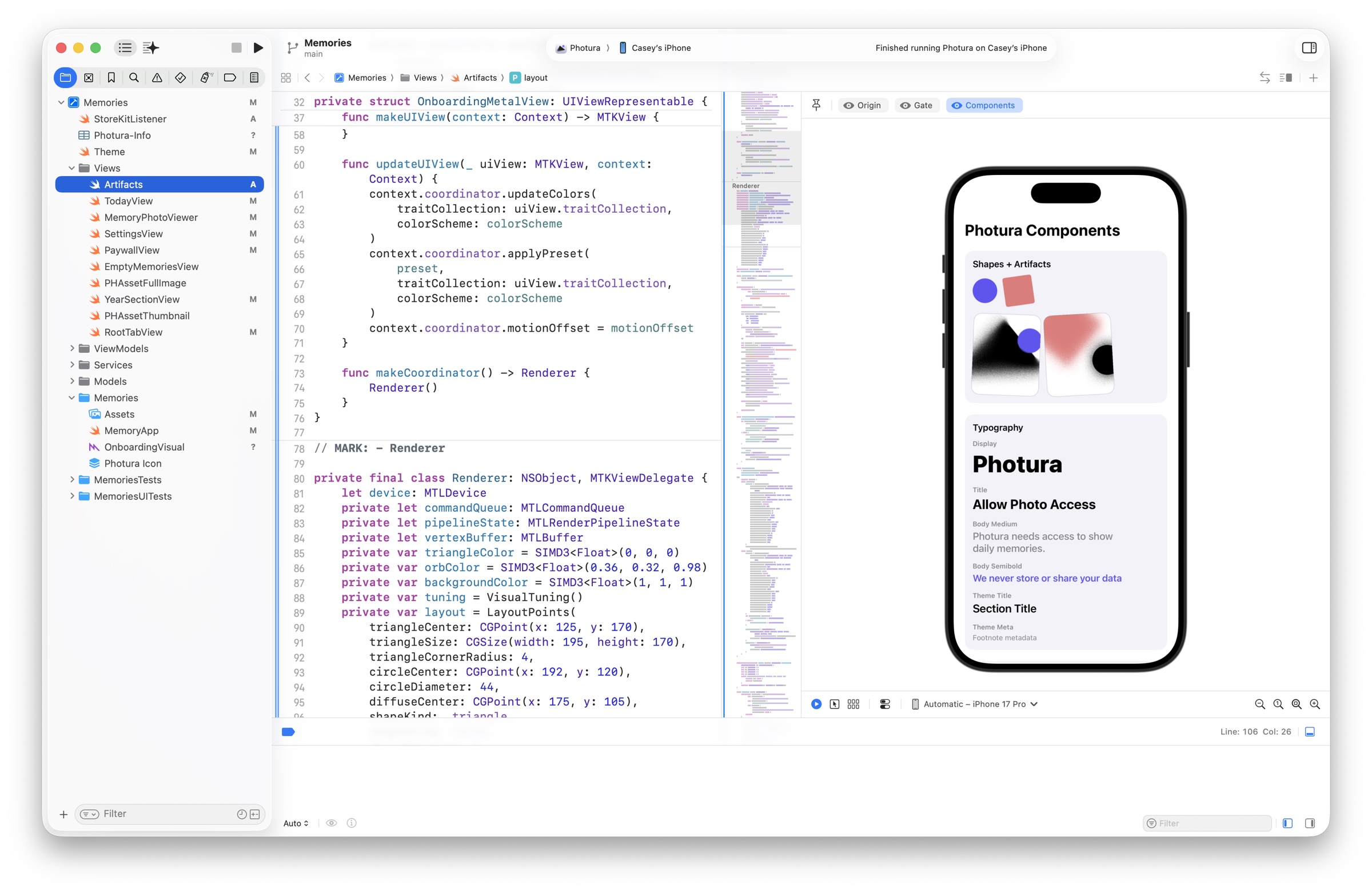
SwiftUI made the distinction between behavior and presentation clearer. I could preserve familiar interactions while giving the app its own typography, surfaces, transitions, and visual tone.
PhotoKit, limited access, thumbnail loading, caching, memory usage, and paging through large collections all shaped the experience. Even a leap-day memory introduces a decision that a static screen can hide.
I used AI alongside Xcode to implement, refactor, and debug. Xcode’s assistant helped with straightforward changes; Codex supported broader exploration and planning. The value was getting from a design decision to working software sooner.
04 / THE EXPERIENCE
I designed Photura around the existing Photos library, with local processing and no account or server required for the core experience. That made the permission decision a central part of onboarding.
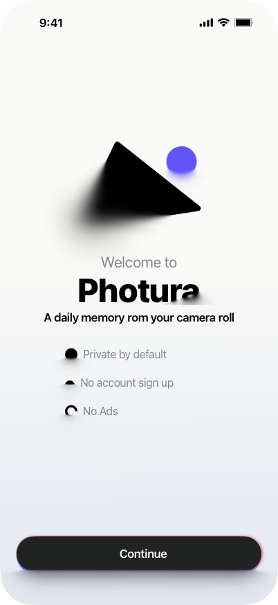
The opening is brief: introduce the promise, explain why access is needed, and let the person decide.
Daily memories, no account to create, and no ads in the experience.
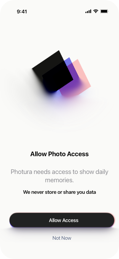
Connect photo permission to its purpose: finding memories from the person’s own library.
A visible “Not Now” keeps the choice in the person’s hands. The implementation also handles limited photo access.
The timeline is for finding a memory. The viewer is for spending time with it. A single image gets the screen, while the controls stay quiet and close to hand.
Date, time, dimensions, and camera information sit one layer deeper. The context is there when it matters, without competing with the photograph.
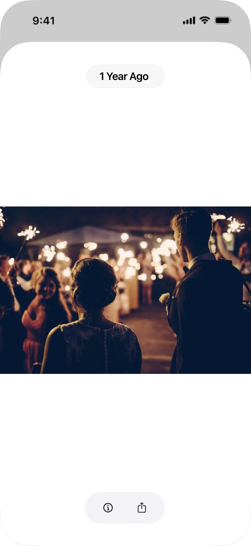
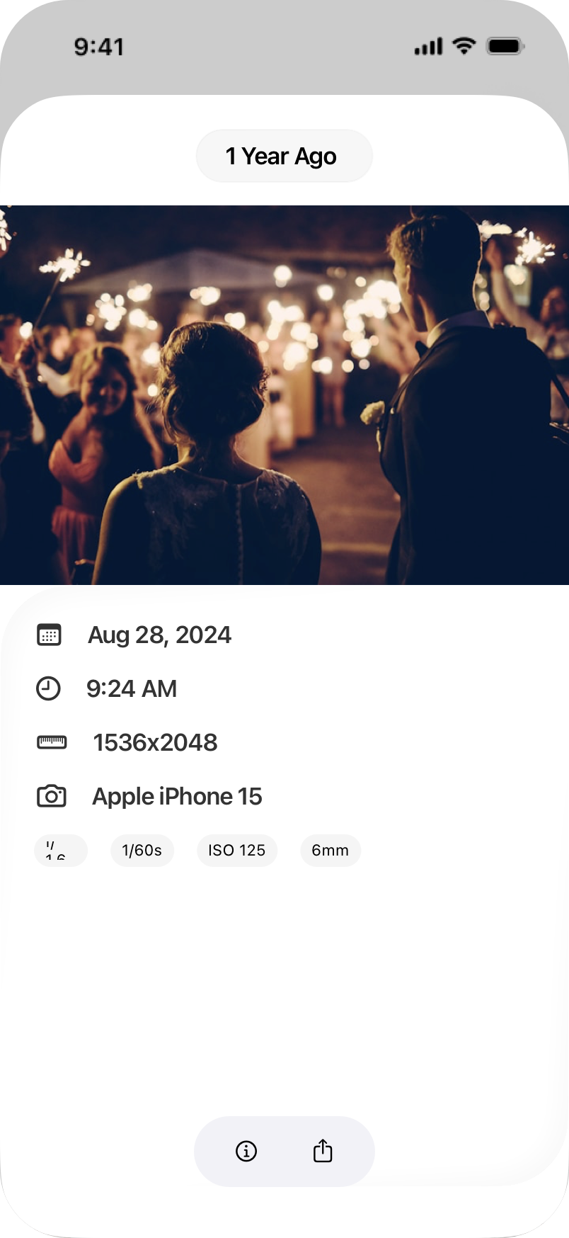
THE MOMENTS AROUND THE MEMORY
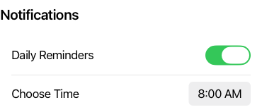
Daily reminders have one job: offer a way back. A time picker and a switch make the invitation adjustable without turning it into another task to manage.
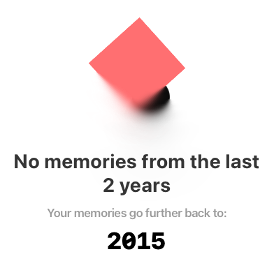
I explored keeping recent memories available while grouping older, blurred or locked memories behind a single “Unlock Memories” treatment. The aim was to make their value clear without scattering paywalls throughout the timeline.
This image shows an exploration of the free experience. The shipped app includes recent memories, with additional years available through an optional purchase.
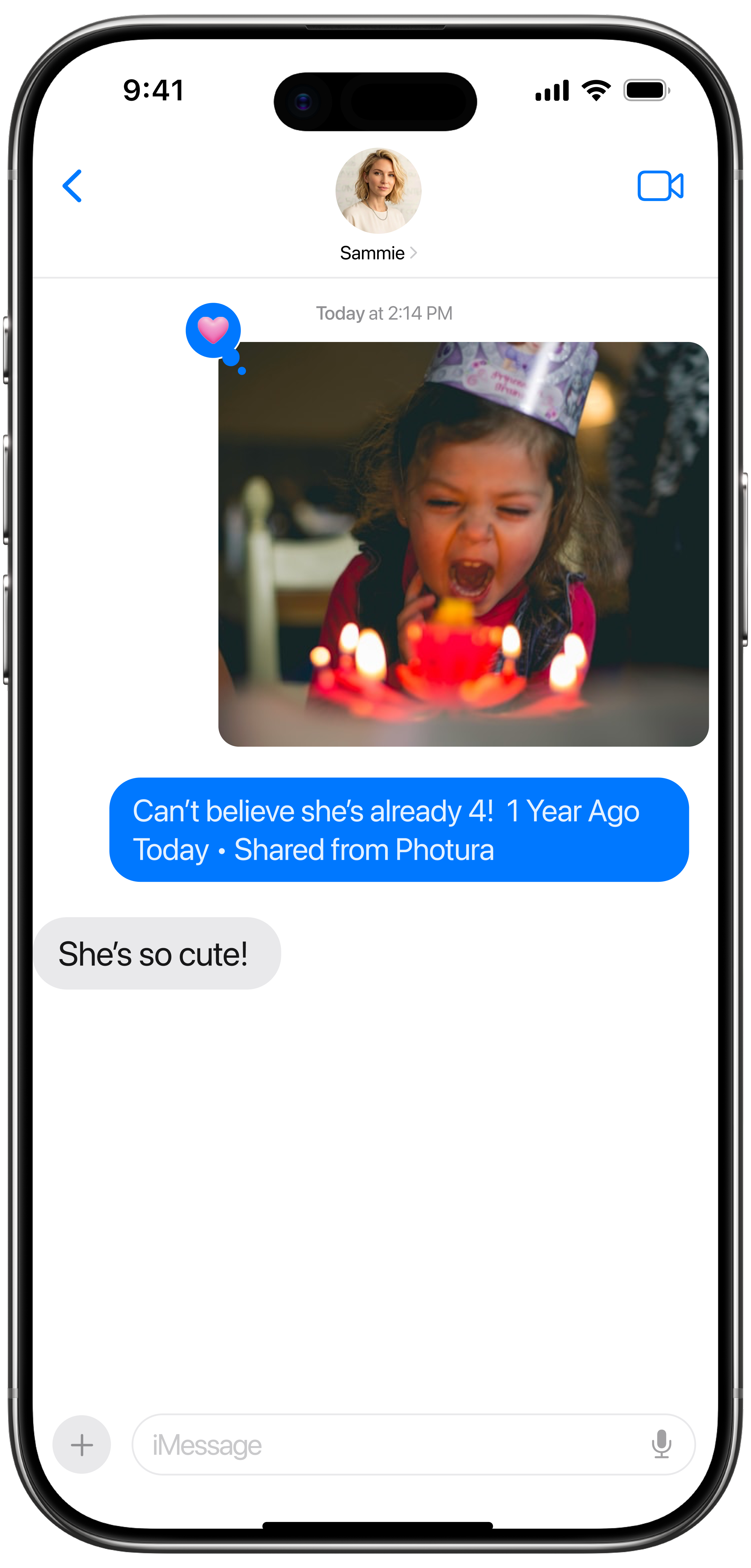
Sharing carries the photo into a conversation that already exists. The app uses the native share sheet, so a rediscovered moment can go straight to someone who remembers it too.
05 / THE IDENTITY
The mountain and circle became another place to learn. Custom Metal pieces such as Origin and Gate introduced grain, diffusion, light, and drift—turning a flat symbol into something with depth and behavior.
Most of the app could stay in SwiftUI. These experiments helped me understand where lower-level rendering was worth the effort. Live controls made the relationships tunable, and the visual language carried into onboarding.
BACK IN THE PRODUCT
The light and dark onboarding studies put the visual system back in context. Motion gives the introduction a character of its own, while the rest of the experience makes room for the photos.
06 / WHERE IT STANDS
Photura is live on the App Store. People have downloaded it, subscribed to it, and used the experience I set out to build. I designed, built, launched, and continue to improve it.
Within a couple of months, subscription revenue had covered my annual Apple Developer Program fee. It was a modest milestone, but a meaningful one: people were willing to pay for a more thoughtful way to return to their memories.
The work continues. The latest designs refine the core experience, while the archive holds the paths I explored, including a broader time-capsule idea that remains an exploration.
View Photura on the App StoreWHAT I TAKE FORWARD
Building Photura changed how I approach product design. Privacy, performance, platform behavior, monetization, and visual craft became decisions I had to make together. Getting closer to the actual product made those decisions better.
A small ritual,
with room for a whole life.

 04 / THE EXPERIENCE
 06 / WHERE IT STANDS